Your Brand Might Be Invisible to AI search – And You Might Not Even Know It

Digital marketing agency in Mumbai - Imageo Media

Here’s something most brands haven’t caught up with yet: the way people search for things has quietly changed under everyone’s feet. And if your marketing strategy hasn’t shifted with it, you’re likely being skipped - not just outranked.

WHAT’S ACTUALLY HAPPENING

People Stopped Browsing. They Started Asking.

Think about how you look things up now versus five years ago. You probably don’t scroll through ten links anymore. You type a question - or speak it - and expect an actual answer, right there, delivered to you. No clicking around. No comparing pages. Just: here’s what you need to know.

That shift didn’t happen overnight, but it’s very real now. Whether someone is using Google’s AI Overviews, asking ChatGPT, talking to Alexa, or using any one of a dozen AI- powered search tools - they’re getting responses generated by systems that have decided, on their behalf, which sources to trust.

For brands, that’s a big deal. Because if those systems aren’t pulling from your content, your brand might as well not exist in that moment - no matter how good your website looks or how much you’ve spent on ads.

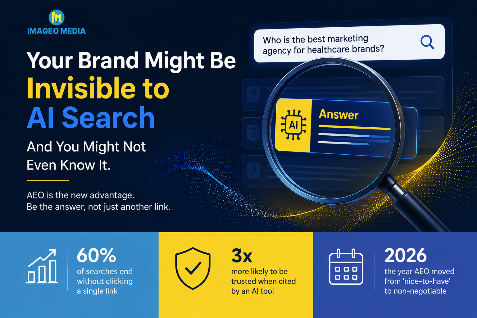
60%

of searches end without anyone clicking a single link

3x

more likely to be trusted when cited directly by an AI tool

2026

the year AEO moved from 'nice-to-have' to genuinely non-negotiable

SO WHAT IS AEO, EXACTLY?

Answer Engine Optimization - In Simple Terms

AEO stands for Answer Engine Optimization. At its core, it means making your content easy for AI-powered tools to understand, trust, and actually use when someone asks a relevant question.
It’s a natural extension of what good marketing has always been: being the most helpful, clearest, most credible voice in the room. The room has just changed. Now it’s a machine deciding who speaks first.
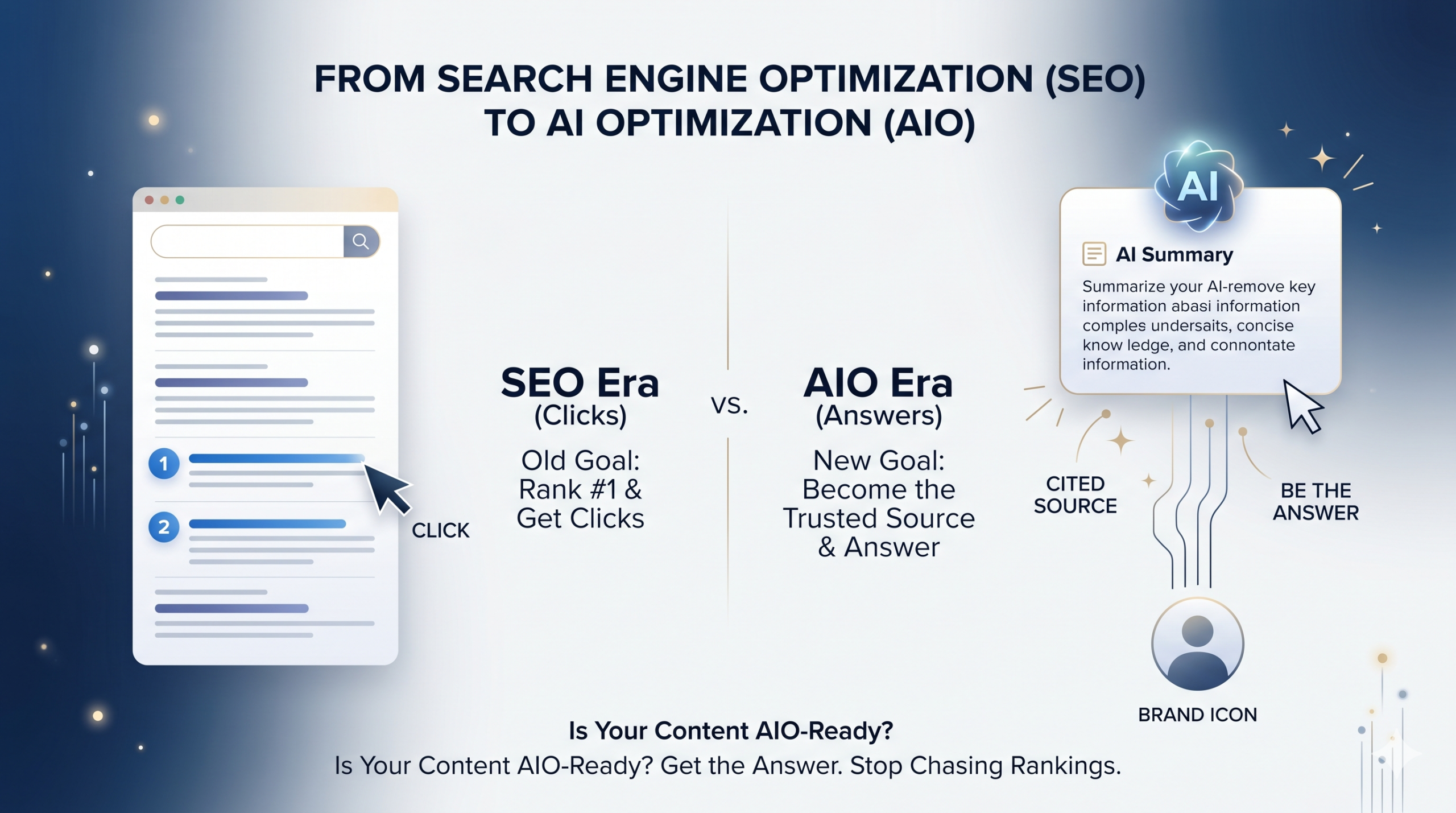
Unlike traditional SEO - which is largely about getting your page to rank high in a list - AEO is about being selected as the answer itself. It’s a subtle but meaningful difference. One gets you seen. The other gets you spoken.

“With AEO, you’re not chasing a ranking anymore. You’re earning the right to be the thing the algorithm says out loud.”

SEO VS AEO

They’re not the same thing - but they work together

A lot of people hear “AEO” and assume it means ditching everything they’ve built with SEO. That’s not quite right. Think of it less like a replacement and more like a second floor. SEO is still the foundation - your technical setup, your domain credibility, your load speeds - all of that still matters. AEO builds on top of it.

Traditional SEO goal AEO goal
Get your page in front of people who are already looking. Drive traffic through rankings and relevance. Get your content cited as the trusted source. Be the answer - not just an option on a list.
How you measure it How you measure it
Click-through rates, organic traffic, keyword position reports. Brand citations in AI responses, zero-click visibility, assisted conversions from AI- referred traffic.

The brands that are winning right now aren’t choosing between SEO and AEO. They’re doing both - with a clear understanding of what each one is for.

WHAT ACTUALLY MOVES THE NEEDLE

Five things that make AI systems pick your brand

1. Write the way people actually talk
AI systems are trained on conversational language. If your content sounds like a legal document, it’s going to get skipped over. Lead with a clear answer. Use real questions as headings. Say the thing directly before you explain it.

2. Use structured data to spell it out
FAQ schema, HowTo markup, and speakable tags are like putting a sticky note on your content that says “this part right here is the answer.” Don’t assume machines will figure it out on their own.

3. Build real credibility signals
Author bios with actual credentials. Original research. Case studies with real numbers. The E-E-A-T framework - Experience, Expertise, Authoritativeness, Trust - isn’t just a Google thing anymore. It’s how AI decides who it should be listening to.

4. Own a topic, not just keywords
The old approach was to chase as many keywords as possible. AEO rewards the opposite - going deep on a defined subject area until you’re genuinely the most useful source on it. Breadth is out. Depth is in.

5. Make your brand entity consistent everywhere
Wikipedia, Wikidata, LinkedIn, Google’s Knowledge Graph, Crunchbase - AI systems cross-reference all of these. If your brand is described differently in different places, or missing from key directories, that inconsistency hurts you.

THE CREATIVE ANGLE MOST BRANDS MISS

Design and production are part of AEO too

Here’s something that often gets left out of the AEO conversation: it’s not just a copywriting or technical SEO exercise. The way your brand presents itself visually - and how that visual identity translates into video, photography, and digital media - affects whether AI systems treat you as a credible, established entity.
A well-produced brand video that gets shared and cited across the web adds to your entity authority. A strong visual identity that’s consistent across every touchpoint helps AI knowledge graphs recognise and categorise you accurately. Creative work isn’t separate from your discoverability - it’s feeding into it constantly.
That’s a big part of why brands that invest in full-service marketing - where creative, digital, and production are all working together - tend to build the kind of presence that AEO rewards. It’s not one team’s job. It’s the whole picture.

“The brands getting cited by AI aren’t just the ones with the best keywords. They’re the ones that look, sound, and feel like the real authority - consistently, everywhere.”

WHERE TO START

You don’t need to overhaul everything at once

The good news is that AEO doesn’t require tearing up what you’ve already built. It’s more about adjusting how you create content from here on out - and making a few targeted updates to what already exists.
Start by looking at your highest-traffic pages. Do they actually answer a clear question in the first two or three sentences? Most don’t - they build up to the answer. Rewriting those opening sections to lead with the point (and then support it) is probably the single fastest win available to most brands right now.
From there, add FAQ schema to your key pages, claim your Google Knowledge Panel if you haven’t already, and start building an internal habit around “what question does this piece of content answer?” Every piece of content your brand produces should have a clear, extractable answer at its heart.
It takes time to see compounding results from AEO, just like it did with SEO. But the brands that start now are building the kind of trusted presence that will be very hard to displace once it’s established.

Ready to make your brand the answer - not just another option?

We help ambitious brands build the creative, digital, and media foundations that AI- powered search rewards. From content strategy to full-scale production, everything we do is built to work together.

Logo design and its importance for brand growth

Digital marketing agency in Mumbai - Imageo Media

The Silent Ambassador: Why Your Logo Is the Most Powerful Tool for Company Growth

Every great brand has one thing in common - a logo that speaks before anyone opens their mouth. Before a customer reads a single word about your company, before they experience your product or service, they see your logo. In that fraction of a second, a world of perception is built. For a business owner, understanding the science and strategy behind logo design is not optional - it is foundational.

The Logo Is Not Just a Symbol

A logo is the singular visual representation of everything your company stands for. It communicates your values, your personality, your promise - all without a single word. Research shows that  75% of consumers recognize a brand by its logo alone , making it the most cost-efficient marketing asset a company can possess.
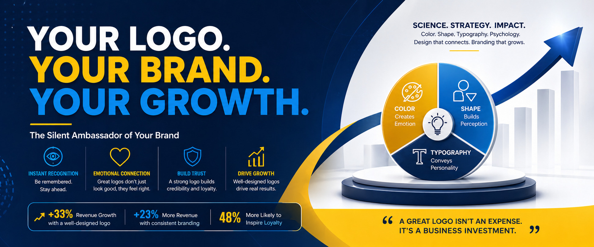
The numbers speak clearly. Companies with well-designed logos experience revenue growth of up to  33% , while consistent branding built around a strong logo can raise overall revenue by up to 23%.   A powerful logo is not a design expense - it is a business investment with measurable returns.

First Impressions Are Formed in Milliseconds

The human brain processes visual information 60,000 times faster than text. Your logo triggers an almost instantaneous emotional and cognitive response in the viewer's mind. This is why professional logo design must go far beyond aesthetics - it must be strategically engineered.

A professionally designed logo achieves several critical objectives simultaneously:

• Instant Recognition - helps customers quickly identify the brand among competitors

• Emotional Connection - colors, shapes, and typography evoke specific emotions

• Brand Consistency - provides a foundation across all marketing materials, from websites to packaging

• Credibility and Trust - a polished logo signals professionalism and reliability

Studies confirm that a well-designed logo is  48% more likely to inspire brand loyalty  among consumers, and companies with robust logo design are  27% more likely to attract new talent  - a benefit that extends well beyond customer acquisition.

The Neuroscience of Logo Design

Modern research has moved beyond intuition. A 2025 study published in Behavioral Sciences combined advanced neuroscience technology with cognitive survey methods to analyze how logo designs activate emotional responses and shape brand perception. The findings confirm that logos stimulate the brain's emotional center, not just the rational decision-making cortex - meaning people feel your brand before they think about it.

This is a critical insight: consumers primarily use  emotions rather than logic  when evaluating brands. A logo that elicits the right emotional response can directly and positively influence purchasing behavior. This is why a scientific approach to design - grounded in color psychology, shape symbolism, and visual hierarchy - is not merely an artistic exercise but a business strategy.

Color Psychological Effect Best Suited For
Red Energy, urgency, passion, excitement Food, retail, sports, entertainment
Blue Trust, calm, professionalism, reliability Finance, technology, healthcare
Green Growth, balance, nature, sustainability Eco-brands, wellness, finance
Yellow Optimism, clarity, warmth, happiness Retail, food, consumer goods
Black Sophistication, luxury, authority Premium, fashion, high-end brands
Orange Creativity, enthusiasm, friendliness Startups, food, media
Purple Wisdom, royalty, creativity Beauty, luxury, education
White Purity, simplicity, clarity Healthcare, tech, minimalist brands

Color is the single most powerful psychological lever in logo design. Research shows that color activates the brain's emotional center, and specific hues trigger consistent emotional and behavioral responses across cultures.

Here is how the major colors work scientifically in brand identity:

A warm colors combination (red, yellow, orange) drives impulse purchasing behavior, while muted and cool tones (blue, green) foster long-term trust and engagement. The key rule:  limit your logo palette to 2–3 colors  for visual cohesion and maximum psychological impact.

Color combinations carry their own science too:

• Multicolor schemes appear youthful and energetic - ideal for children's or lifestyle brands

• Black and whiteprojects classic sophistication and maturity

• Monochromatic schemesprovide a unified, premium feel

• Neutral + accent colorharnesses the emotional power of a single vibrant hue without visual noise

The Science of Shapes in Logo Design

While color speaks to emotion, shapes communicate personality and trust. Shape psychology in logo design is a well-established discipline - every geometric form carries deeply rooted psychological associations:


Circles and ovals - Represent unity, community, wholeness, and continuity. Brands like BMW, Pepsi, and LG use circular logos to project approachability and inclusiveness.

Squares and rectangles - Convey stability, strength, reliability, and order. Common in banking and legal industries where trust is paramount.

Triangles - Suggest direction, ambition, power, and dynamism. Often used in energy, automotive, and technology brands.

Organic/curved shapes - Signal creativity, warmth, and humanity. A curve softens a brand, making it feel more accessible and friendly.

Angular/sharp shapes -Communicate precision, efficiency, and innovation. Technology and engineering brands favor these.


A landmark study published in the International Review of Management and Marketing confirmed that  logo shapes directly influence brand loyalty and repurchase intentions, with brand attitude acting as a significant mediator. In simple terms: the wrong shape can make customers disengage, while the right shape deepens their loyalty.

Typography: The Third Pillar of Logo Science

The choice of typeface in your logo completes the trifecta of scientific logo design. Typography is not about which font looks attractive - it is about what the font communicates subconsciously:

Serif fonts (e.g., Times New Roman style) - Evoke tradition, heritage, and reliability. Used by brands like Vogue, Harvard, and The New York Times.

Sans-serif fonts - Project modernity, simplicity, and clean thinking. Apple, Google, and Nike all leverage this.

Script/handwritten fonts - Feel personal, creative, and authentic. Common in boutique, artisan, and beauty brands.

Display/decorative fonts - Bold and unique; ideal for entertainment or brands that want a strong visual personality.

Lessons from the World's Top Brands

An analysis of  Interbrand's Top 100 Global Brands  revealed that the most successful logos are deliberately engineered using four primary logotype strategies - shape-only logos, wordmarks, lettermarks, and combination marks - with each choice strategically aligned to the brand's market positioning. None of these logos were designed by accident. Every curve, every color hex value, and every typeface weight was a calculated decision.
Coca-Cola's red triggers excitement and appetite. Facebook's blue builds trust and calm connectivity. McDonald's golden arches are yellow for happiness and optimism - deliberately designed to stimulate the reward center of the brain. These are not coincidences; they are science in action.

The Business Case: ROI of Great Logo Design

For skeptics who view logo design as a luxury, consider these data points:• Consistent logo display across platforms correlates with a  23% increase in revenue

• Companies with well-designed logos may experience up to  33% revenue growth

• Logo redesigns correlate with an average 11% revenue growth    in the first year post- launch

• Businesses using logos effectively on social media see a  13% increase in brand awareness

60% of companies  report that consistent branding added  10–20% to their revenue growth

These figures make a compelling case: a professionally designed, scientifically informed logo is one of the highest-ROI investments a growing company can make.

A Strategic Checklist for Logo Design

When briefing a designer or evaluating a logo, apply this scientific framework:

1. Define your brand personality first - Are you trustworthy, energetic, premium, playful, or innovative?

2. Choose colors that align with your target audience's psychology - Not just what looks nice

3. Select shapes that reinforce your brand promise - Curves for warmth, angles for precision

4. Pick typography that matches your era and positioning - Serif for legacy, sans-serif for modernity

5. Test across scales - Your logo must work on a billboard and a mobile favicon equally

6. Limit complexity - The best logos in the world are simple, scalable, and timeless

7. Consider cultural context - Colors and symbols carry different meanings across regions and markets

The Bottom Line

A logo is not a decoration. It is a  strategic business asset  - one that works 24 hours a day, 365 days a year, across every touchpoint your brand occupies. When designed with scientific intention - with deliberate color psychology, shape symbolism, and typographic reasoning - it becomes the most powerful silent salesperson your company has.

In a competitive marketplace, the brands that grow are the brands that are remembered. And the first thing that makes a brand memorable is almost always its logo.

"Design is not just what it looks like and feels like. Design is how it works." - Steve Jobs

Invest in your logo not as a cosmetic exercise, but as the cornerstone of your company's identity, trust, and growth.

Key Elements Every Brand Book Should Include

Digital marketing agency in Mumbai - Imageo Media

A comprehensive brand book serves as the foundation for consistent and effective brand communication. While each brand may tailor its brand book to its unique needs, there are several essential elements that should be included in every brand book to ensure clarity, consistency, and impact.

1. Brand Overview and Story

• Mission and vision statements
• Brand values and promise
• Origin story and brand history
• Unique selling proposition (USP) and positioning

2. Target Audience and Brand Persona

• Definition of target audience or customer personas
• Brand personality traits and tone
• Competitor analysis (optional but helpful for context)

3. Logo Guidelines

• Primary and secondary logo versions
• Usage rules, clear space, minimum sizes, and incorrect usage examples
• Logo history and evolution (if relevant)
• Unique selling proposition (USP) and positioning

4. Color Palette

• Primary and secondary color palettes
• Exact color codes (HEX, RGB, CMYK, and Pantone if needed)
• Usage instructions for digital and print media

5. Typography

• Primary and secondary fonts
• Font families, sizes, weights, and hierarchy
• Usage scenarios and spacing rules

6. Imagery and Visual Style

• Photography style and treatment
• Illustration and iconography guidelines
• Examples of approved imagery and graphics

7. Voice, Tone, and Messaging

• Brand voice and tone guidelines
• Writing style guide, including dos and don’ts
• Sample messaging for various channels (e.g., social media, email)

8. Brand Applications

• Examples of branded materials (business cards, letterheads, invoices)
• Digital asset guidelines (website, social media, app icons)
• Marketing collateral samples

9. Social Media and Digital Guidelines

• Social media visual and messaging standards
• Email signature and digital communication templates

10. Contact Information and Resources

• Points of contact for brand-related questions
• Links to downloadable assets or further resources

Including these components ensures your brand book is a practical, user-friendly reference that empowers everyone - internal teams, partners, and vendors - to represent your brand with consistency and confidence.

The Power of Visual Identity in Building Strong Brands

Digital marketing agency in Mumbai - Imageo Media

Your Branding Is Failing If This Is Wrong

Visual identity elements - especially logos and colors - play a central role in shaping how a brand is perceived by its audience. These elements act as the “face” of the brand, conveying its personality, values, and promise often within seconds of first contact.

Logos: The Cornerstone of Recognition and Trust

A logo is often the most recognizable aspect of a brand. It serves as a visual shorthand, instantly evoking associations with the brand’s values, mission, and quality.

Well-designed logos help distinguish a brand from competitors and foster a sense of familiarity and trust. Iconic examples like the Nike swoosh or Apple’s apple are instantly recognizable and carry strong emotional associations.

Consistency in logo usage across all platforms reinforces    brand identity and builds consumer confidence.

Colors: Emotional Triggers and Brand Messaging

Colors are powerful psychological tools that evoke specific emotions and influence how a brand is perceived at a subconscious level.

For example, blue is often associated with trust and reliability, making it a popular choice for tech and finance brands, while red evokes excitement, passion, and urgency, frequently used by food and entertainment brands.

The strategic use of color helps brands communicate their values and personality without words, shaping the mood and expectations of their audience.

Consistency: Building Recognition and Loyalty

When logos, colors, and other visual elements are used consistently across all touchpoints - websites, packaging, social media, and advertising - they create a unified brand presence.

This consistency not only increases brand recognition but also builds trust, as consumers come to expect a certain look and feel from the brand.

A distinctive visual identity sets a brand apart from competitors and helps create a unique impression in the minds of consumers.

The right combination of logo and color can evoke emotions, tell a story, and foster a lasting connection with the audience, influencing purchasing decisions and brand loyalty.

In Summary

Logos and colors are not just decorative - they are strategic assets that communicate a brand’s essence, build trust, and shape public perception. Brands that invest in a cohesive and consistent visual identity are more likely to stand out, be remembered, and earn lasting customer loyalty.

Why Every Brand Needs a Brand Book

Digital marketing agency in Mumbai - Imageo Media

In today’s fast-paced, multi-channel world, building a recognizable and trusted brand is more challenging-and more crucial - than ever. Whether you’re a startup, a growing SME, or a global enterprise, the secret to a strong brand isn’t just a great logo or a catchy tagline. It’s consistency. That’s where brand guidelines and a brand book come in.

What Are Brand Guidelines?

Brand guidelines, sometimes called brand style guides, are a set of clearly defined rules and standards that dictate how your brand should be represented to the world. Think of them as your brand’s “rulebook”-centralizing everything from your logo usage and color palette to your tone of voice and imagery. These guidelines ensure that everyone, from your internal teams to external partners, knows how to communicate and present your brand in a unified way.

 What’s Inside a Brand Book?

A brand book is the practical, user-friendly manual that houses your brand guidelines. It typically includes:

Company Mission, Vision, and Values: The “why” behind your brand.
Logo Usage: Rules for placement, sizing, and acceptable variations.
Color Palette: Exact color codes for print and digital use.
Typography: Approved fonts and usage scenarios.
Imagery and Iconography: Style, tone, and types of visuals to use.
Tone of Voice and Messaging: Guidance on language, grammar, and personality.
Templates: Business cards, letterheads, and other branded materials.

Why Every Brand Should Have a Brand Book

1. Consistency Across All Touchpoints

Every interaction with your brand-whether it’s a tweet, a billboard, or a customer service email-shapes how people perceive you. A brand book ensures that your brand looks, feels, and sounds the same everywhere, building a cohesive and memorable identity.

2. Builds Trust and Credibility

Consistent branding signals professionalism. When your visuals and messaging align, customers are more likely to trust you and see you as reliable. This trust translates into loyalty and, ultimately, sales.

3. Streamlines Collaboration and Onboarding

A brand book is a powerful onboarding tool for new hires, agencies, and partners. It eliminates guesswork and speeds up the creative process, allowing everyone to hit the ground running and produce on-brand work from day one.

4. Drives Efficiency and Creativity

Contrary to popular belief, guidelines don’t stifle creativity-they provide a framework that actually fosters it. With clear parameters in place, teams can focus on innovation rather than reinventing the wheel for every project.

5. Future-Proofs Your Brand

As your business grows, your brand will appear in new places and formats. A brand book acts as a roadmap, helping you scale your branding efforts without losing your core identity.

6. Enhances Brand Recognition

Iconic brands like Apple, Starbucks, and Google are instantly recognizable because of their unwavering commitment to consistency. A well-crafted brand book is the foundation for achieving this level of recognition.

“A brand book is like giving your team (and any external partners) the clearest, most efficient directions. It’s a detailed map with all the key routes and landmarks marked, so everyone knows exactly where they’re headed.”

In Summary

A brand book isn’t just a “nice-to-have”-it’s a business essential. It’s your blueprint for building a brand that’s consistent, credible, and memorable. If you want your brand to stand out, scale up, and stay relevant, investing in comprehensive brand guidelines is the smartest move you can make.
Ready to future-proof your brand? Start building your brand book today.

The Brand Video Illusion: Views Without Memory

Digital marketing agency in Mumbai - Imageo Media

80% of brand videos fail to drive recall

The views in this article draw on the latest industry research and my 30+ years working with various brands. Let's get into it.
We are living in the golden age of brand video. More video content is being produced right now than at any other moment in marketing history. Brands are spending billions. Teams are grinding on scripts, storyboards, and production timelines. And yet, when researchers actually measure what viewers remember - the results are nothing short of humbling.
A landmark LinkedIn B2B Institute and Media Science study found that 81% of B2B video ads fail to register with viewers - meaning they generate neither adequate attention nor brand recall. A separate RK Swamy–Hansa Research study of 3,000 consumers found that despite people watching an average of 2.17 hours of video daily, they recalled only 1.5 brands on average - and out of 600+ brands studied, only 11 crossed the 3% recall threshold. Let that sink in: 600 brands, invisible.
The spend is real. The views are real. The recall? Mostly fiction.
So, what's going wrong? Why brand videos fail to leave any fingerprint on the human brain?

The Brand Hides in Plain Sight

Here's the most ironic failure mode in brand video: the brand isn't actually in the video. Or rather, it shows up so late, so small, or so timidly that the audience never makes the connection. You craft a beautiful two-minute emotional narrative, and the logo appears in the last three seconds like a shy teenager at prom.
Research confirms this is catastrophic. In the LinkedIn/Media Science study, of participants who did see a B2B ad, only 36% could correctly identify the brand. The creative existed. The brand integration did not. If viewers can't attribute your story to your company, you haven't made an ad - you've made a donation to ambient content.
The fix isn't slapping your logo on every frame. It's building your brand identity into the narrative - through visual language, tone, character, and recurring sensory triggers that make the brand inseparable from the story.

Relevance Is the Recall Engine

As Jay Baer once said: you can either be disproportionately emotional, or massively relevant - and relevancy is the killer app. Most brand videos are neither. They're polished, they're expensive, and they're profoundly generic.
Research by Prezi found that 55% of consumers forget branded content primarily because it's irrelevant to them. Another 69% of digital video viewers report that the ads shown to them feel irrelevant to their lives. When content doesn't connect to a viewer's actual world - their job, their problems, their aspirations - the brain literally does not flag it as worth storing. Memory is a filing system. Irrelevant content never gets filed.
The uncomfortable truth for marketers is this: a video that feels personally irrelevant to the viewer is worse than no video at all, because it actively trains the audience to tune you out. You spend money teaching people to ignore you.

You're Optimizing for Views, Not Memory

The metrics dashboard is lying to you. View count, completion rate, click-through - these are attention metrics. They tell you someone's eyes were pointed in your direction for a moment. They tell you nothing about whether your brand moved from short-term stimulus to long-term memory structure.
Neuroscience research published in Frontiers in Psychology found strong correlations between emotional brain response and long-term ad recall - meaning the feeling a video creates is the mechanism of memory, not the number of seconds someone watched. Yet most brand video briefs are optimized around engagement metrics and production aesthetics, not emotional architecture.
The LAMBDA memorability dataset - the first large-scale study on long-term ad memorability, covering 1,749 participants and 2,205 ads across 276 brands - reinforces this: long-term memorability requires structural design, not just compelling visuals. You have to engineer recall; not hope it happens.

Content Overload Is Eating Your Investment

Here's the brutal math of modern attention: your video doesn't just compete against your competitor's video. It competes against every notification, meme, news headline, family photo, and cat video in the known universe. The average person is drowning in content, and their brain has evolved a ruthless defense mechanism - aggressive forgetting.
Prezi's research found that 80% of consumers forget branded content within just 3 days. Not 80% of bad content. 80% of all branded content. One of the top reasons cited? "Too much content to retain" - reported by 30% of respondents. You're not just fighting for attention; you're fighting against the architecture of human cognition.
The implication is stark: frequency without distinctiveness is waste. Posting more videos of the same forgettable type doesn't build memory - it builds immunity.

Emotion Without Narrative Is Decoration

A lot of brand videos feel emotional in the moment — sweeping music, cinematic shots, a dog, maybe a sunrise. But emotion alone doesn't create durable memory. Narrative does. Emotion attached to a story does. There's a profound difference between a video that makes someone feel something and a video that gives them a story to retell.
Research on viral video advertising found that entertainment value drives sharing, but social value drives brand equity. In other words, the videos that get passed around aren't necessarily the ones building your brand in memory. The content that actually sticks is content that tells the audience something new - rated as the most memorable content type, ahead of emotional stories and product information.
The great brand videos aren't just felt - they're retold. They give the viewer a surprising idea, a useful reframe, or a story worth repeating at dinner. That's what earns a place in memory.

The Audio Layer Is Being Ignored

Here's something most video marketers don't know: video is increasingly consumed as audio. With 50% of viewers muting ads they can't skip, and streaming-as-background-sound now accounting for 35% of all listening time, your visual-only brand strategy has a massive blind spot.
Research by Audion found that combining digital audio within video content drives 76% brand recall versus lower rates for visual-only approaches, with 80% message accuracy when audio is intentionally layered. Your brand voice, sonic logo, music choice, and narration tone are recall mechanisms - not production details.
If your video only works with the sound on, it doesn't work.

What the 20% Are Doing Right

The brands that beat the recall gap share a handful of non-negotiable habits:


They brand early and repeatedly - identity cues appear within the first three seconds, not the last three
They engineer emotion and narrative - not just mood, but a story with a beginning, tension, and resolution tied to the brand
They create distinctive sensory assets - a sonic identity, a visual grammar, a tonal signature that makes them recognizable without a logo
They obsess over relevance - they know exactly who they're talking to, and the viewer feels it
They think in memory structures - each piece of content reinforces the same brand associations rather than chasing a new creative concept every quarter
They treat audio as a first-class citizen - not background music, but a deliberate recall mechanism

The video revolution has democratized production but not impact. Anyone can make a beautiful video today. Very few brands know how to make a memorable one. And in a world where viewers recall only 1.5 brands from hours of daily watching, the gap between beautiful and memorable is worth everything.
Stop making videos people watch. Start making videos people remember.